Page 1 of 1
Am I Wrong...
Posted: Thu Jun 22, 2017 7:36 am
by LouieMacGoo
...about this logo? Every August there is a huge gathering of homebrewers here in Michigan called
Michigan Homebrew Festival. This is the logo that the are going with and i really don't care for it. I would not want to pay money for a shirt with this on it, let alone wear it.
1. It's based on an "inside joke" that a few of the organizers and some other participants are only familiar with.
2. It really has nothing to do with beer or homebrewing
3. It's slightly off color, especially for a public event like this one.
4. It's just ugly.
Thoughts?
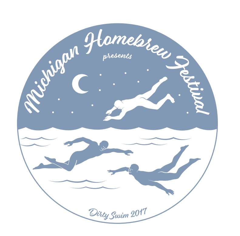
- MHFlogoBlue.jpeg (88.34 KiB) Viewed 3541 times
Re: Am I Wrong...
Posted: Thu Jun 22, 2017 7:53 am
by John Sand
You are not wrong. That is disturbing.
Re: Am I Wrong...
Posted: Thu Jun 22, 2017 8:18 am
by BlackDuck
I agree with every point your making. I bet the only ones that like that logo are the ones that are in the know about the "inside joke".
Re: Am I Wrong...
Posted: Thu Jun 22, 2017 9:10 am
by Beer-lord
Was this design created while skinny-dipping? Might pass as a bottle label but on a shirt? Guaranteed to get people talking I bet.
Re: Am I Wrong...
Posted: Thu Jun 22, 2017 11:39 am
by Inkleg
How'd I miss out on that swim?

Inside joke or not there's not anything that would appeal to me to buy it.
Re: Am I Wrong...
Posted: Thu Jun 22, 2017 11:56 am
by Kealia
Agreed, not appealing at all.
Re: Am I Wrong...
Posted: Thu Jun 22, 2017 1:23 pm
by brewnewb
Seems more appropriate for a swingers club festival.
Re: Am I Wrong...
Posted: Thu Jun 22, 2017 2:37 pm
by Beer-lord
brewnewb wrote:Seems more appropriate for a swingers club festival.
But that would need to be a totally separate section of this forum!

Re: Am I Wrong...
Posted: Thu Jun 22, 2017 3:07 pm
by Dawg LB Steve
UM, OK!

Re: Am I Wrong...
Posted: Thu Jun 22, 2017 5:58 pm
by mashani
They lost their kilts....
Re: Am I Wrong...
Posted: Sat Jun 24, 2017 12:05 am
by The_Professor
LouieMacGoo wrote:1. It's based on an "inside joke" that a few of the organizers and some other participants are only familiar with.
.......Thoughts?
MHFlogoBlue.jpeg
Gay aliens invading earth from the sea? How close am I?
Re: Am I Wrong...
Posted: Sat Jun 24, 2017 6:26 am
by FedoraDave
Not only are your points valid, and I concur, but the lettering is difficult to read.
I think I'm going to send a link of this to my sister, who, while not a graphic artist, is a fine artist (or should I write Fine Artist, I mean, she has a BFA ... well, she's a professional artist, dammit!) just to get her opinion.
But this layman thinks it's a fugly logo.
Re: Am I Wrong...
Posted: Sun Jun 25, 2017 2:02 pm
by Whamolagan
Re: Am I Wrong...
Posted: Tue Jun 27, 2017 4:55 am
by FedoraDave
Well, here's what my sister said:
"I don’t actually hate it. It’s a nice color blue, on my monitor anyway. It’s a bit complex and too detailed for a logo proper, but for a one-off event, it’s not bad. The composition is reasonably well-balanced and protects its space. There’s some grace in the artwork and a kind of relaxed carefree feel. I don’t find the type illegible or unappealing and I am not offended by the Androgynous Pod People of Planet Pilates Swimming by Starlight, possibly in pools of beer. It would be better if that were the caption. “Dirty Swim” is completely and utterly repulsive. Take that out, and I’d wear the tee shirt.
BUT - if you want it to actually have some relation to a *Homebrew Festival*, it doesn’t seem to fit the bill very well. Surely there are things that would suggest the subject better than the APPofPPSbS. There's plenty of drinking/brewing apparatus to deploy. The BeerBorg logo is pretty cute without being a total cliché. Or emphasize the Michigan location. At least make it more festive. Between the blue, the script, and the even wave pattern of the horizontal, symmetrical division, this is too laid-back to say festival to me at all (though the APP seem to be having a relaxing good time)."
So, I guess she thinks it's okay from a technical and artistic standpoint, but as far as promoting a festival, they could have done better.